Visualizing Complex Map Data for User Research
Prototyping to solve geospatial visualization challenges
I used my hybrid design/development skills to rapidly build data-driven prototypes, leading the team to effective ideation, more productive testing sessions, richer insights and a better end result for our users.
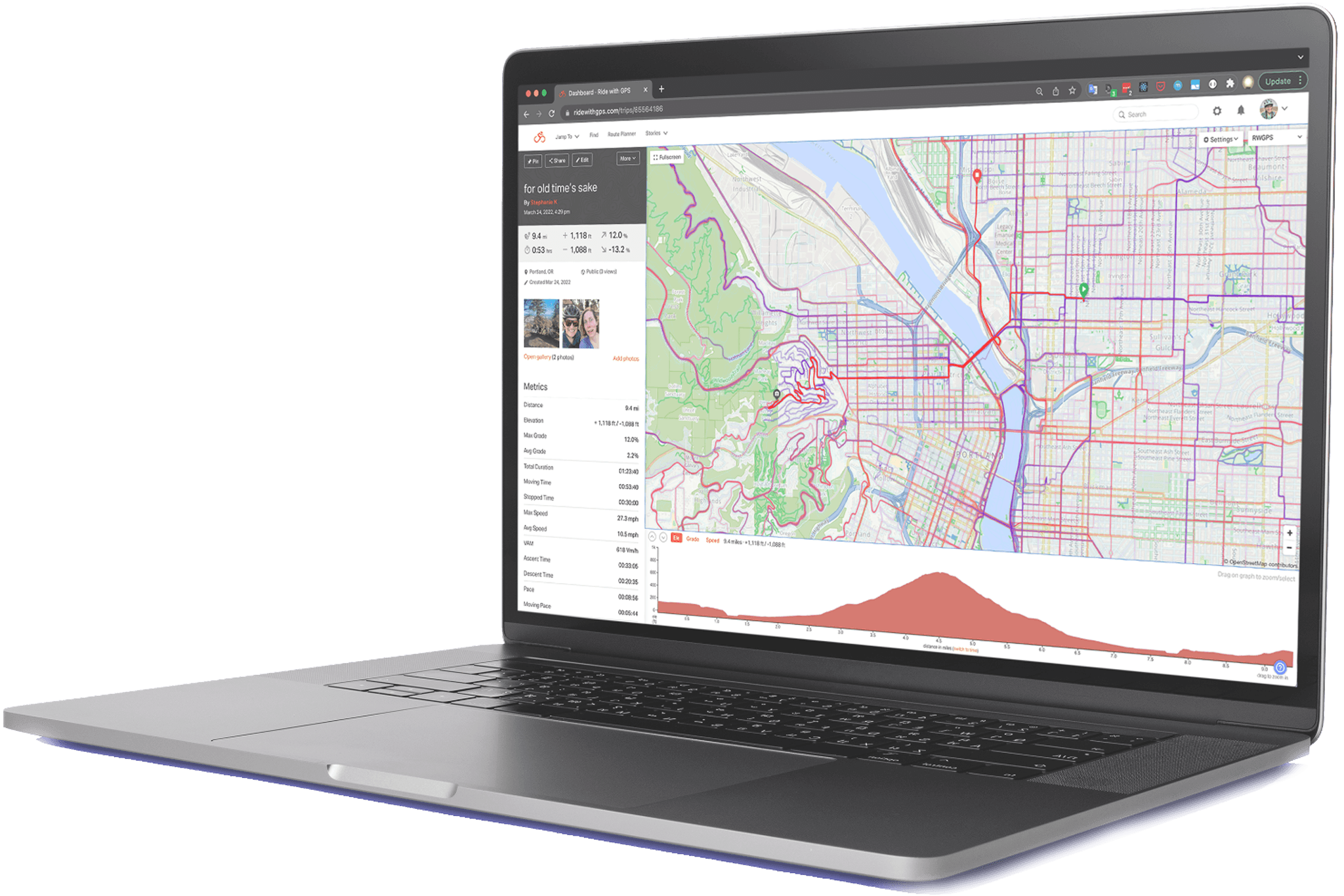
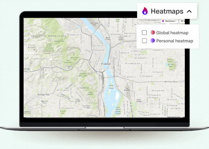
Ride With GPS is a mobile and web app that people use to plan and navigate bike routes. One of our recent feature releases was a Global Heatmap that aggregated ride data from millions of customers into a map layer that indicates popularity with cyclists. This feature was successful, but it was conceived of with no UXR at all besides "people keep asking for this".
Hot on the heels of the Global Heatmap, the next feature on our roadmap was a Personal Heatmap which seemed like a logical next step. I worked with the UX designer and product manager to ensure that we approached the feature with a research mindset.
The problem statement was two-fold:
#1
How do we visualize an additional layer of usage data on top of a dense map UI in a beautiful and intuitive way?#2
What do people want to do with their personal map data? What meaning do riders attribute to their own ride histories?For this first question, the designer and PM were my customers. I set out to build an internal prototype that would help us explore visual solutions on the map.
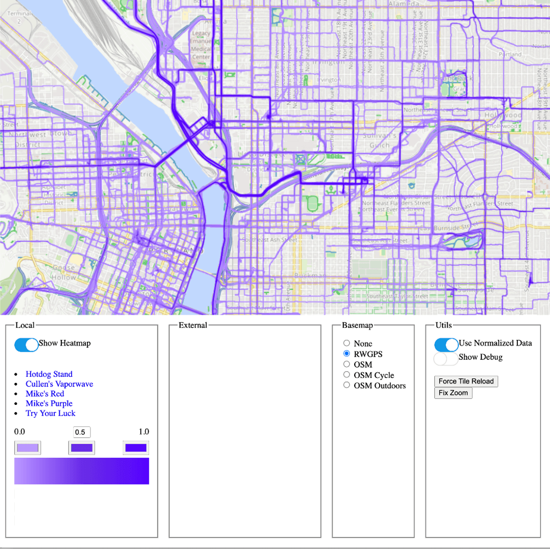
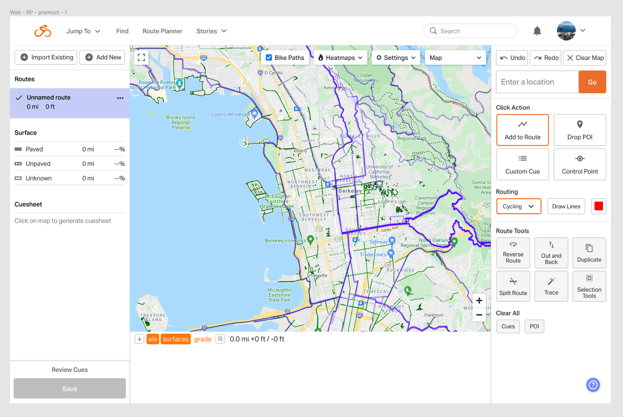
The heatmap visuals were rendered on our web-based maps as raster PNG tiles, which came from a generation service that was written in Rust by a backend engineer. It generated PNG images based on query parameters sent to the endpoint. The frontend displayed below is a simple HTML template that composed those URL params, fetched the tiles from the endpoint, and displayed them on a map.
You can see that this first version of the Personal Heatmap color styling looks cluttered and visually fatiguing, with too much visual weight on the lower end of the spectrum:
I came up with the idea of adding an opacity parameter to fade out the lower end. The backend engineer who owned the service said that it was possible, but he was on another project and did not have bandwidth to make the change at that time. We wanted to move forward with testing this feature as soon as possible, so I rolled up my sleeves and learned a bit of Rust to add the opacity parameter myself.
My background in computer graphics helped me understand the RGBA solution, and it turns out that writing Rust was pretty fun. I became the second person ever to commit to the Heatmapper repo, and my colleague was excited that someone else was able to contribute to his code.
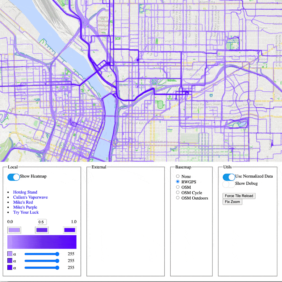
This is the result after the opacity param is added. The map becomes much easier to read, with the important information standing out and the less important information receding.
With the opacity param, an attractive monochromatic scheme became possible for both the personal and global heatmaps. The designer and PM were able to use my modified prototype to pin down the exact color params they wanted for those features moving forward.
With the first part of problem statement solved, we moved on to the next part. It was time to focus on the customer-facing implementation of the Personal Heatmaps feature. We needed to learn more about how people understood and used their personal cycling data.
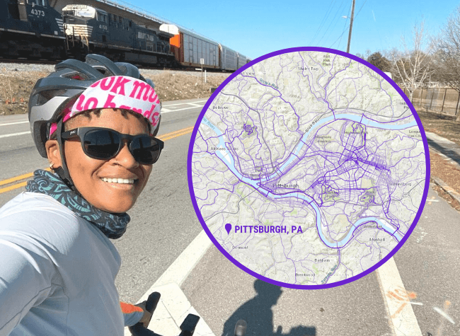
Our designer attacked the problem with his primary tool, which is Figma mockups. He used his personal heatmap from the Berkeley area to make a screen mock showing how the heatmap layer would look in our route planner. The problem, of course, is that not everyone lives in Berkeley (or Portland, or New York, etc.)
And even in the same city, people can have very different biking relationships to certain areas or neighborhoods! Your individual riding history is very personal. Each line on that map means something to you. You get an emotional reaction to seeing your own data come alive.
So you can imagine, when we put the Berkeley-based mockup in front of people in a few interviews, the feedback was only mildly useful. People who don’t live in the area have no particular relationship to the roads and trails shown.
I came in as the UX Engineer to build a prototype that would allow us to test the Personal Heatmaps feature with individualized user data, leading to more productive testing sessions, richer insights and a better end result.
We used this prototype to test with users in remote user testing sessions. The prototype was built into the production frontend of ridewithgps.com, but it was protected by whitelisting only those users that were involved in test sessions.
This is a screen recording of the prototype we tested with users- you can see in the corner that I’m logged in and this is my live data.
We ran user research sessions with 6 users, and uncovered valuable insights:
Armed with the findings from our research sessions, the designer made some updates to the design and I got to work building it into the front end. I was able to reuse the prototype code for the map layer itself, which was a pretty big win on a small dev team. After a few weeks of implementation and QA, we released the feature to the public.
I implemented Google Analytics tracking calls so that we could have a quick and easy way to gather success metrics. This feature was available to Premium users only, so we measured success by the # of upsells that were prompted by an in-app upsell nudge centered around Personal Heatmaps.
Immediate feedback through our social channels and customer support contact was very positive. People seemed to really connect with their personal data, and many read it as a challenge to fill in the parts of the map they hadn’t ridden yet and experience new parts of their neighborhoods and towns.
The Personal Heatmaps feature was responsible for 24.3% of all upsell nudge views and 8.1% of all upsell conversions in the first month after release.
The feature also had great saturation with our existing customers. One month after launch, the Personal Heatmaps layer was used over 31,200 times by over 72% of the app's Premium customers.
This case study demonstrates the value of interactive code-based UX prototyping that goes beyond the limitations of traditional mockup tools like Figma.
For the initial ideation phase, my engineering skills allowed me to dive into the backend code to give the product and design stakeholders a tool to visually problem-solve. This had the added benefit of guaranteeing that any visual solution they came up with would be compatible with existing tech infrastructure, which significantly de-risked the development process.
When we began talking to our users, I identified flaws in our current research strategy (namely, that we were using static test data that our users can't relate to) and rapidly devised and built a solution that addressed these flaws. My understanding of the frontend code and the app's data layer allowed us to use real, user-specific data when testing with individual people. This led to more productive testing sessions, richer insights, more actionable feedback, and a more delightful end product.